Welcome to the Polytek Brand Guidelines.
01 Logo
A streamlined brand
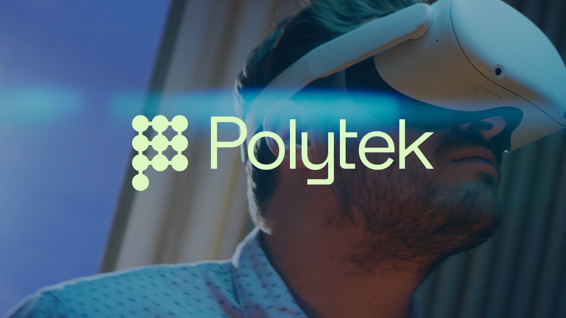
Just like our process, the Polytek brand strives for a harmonious and streamlined identity. Therefore, the logo represents the connection of our expertise, of people and a streamlined process.
Primary Logo
Preferably, always use the primary logo (= symbol + workmark). The workmark can not be used on its own. The symbol can be used on its own (see further).
To ensure visibility, always use the green version of the logo on a dark blue background, or the dark blue version on a light background (see further for more details about use of color).
The black or white version of the logo are only to be used when color printing is not available.


Clear space
A certain amount of space is needed around the primary logo to prevent it from becoming cluttered by surrounding text, images, or the edge of a page. This is the case for all iterations of the logo.
When using the primary logo, the minimum space is equal to the total height of the primary logo.
This is the minimum clear space, not a fixed amount. (You can have more clear space if need).
symbol
The symbol of Polytek represented the letter 'P' and is built from dots that are connected. This is a visual representation of how Polytek streamlines and smoothly connects a wide range of expertise.
The symbol can be used as:
- A profile picture for social media, apps and tools
- An ornament or detail on print and digital designs, but only when the Polytek context is clear and to avoid repetition of the full logo

Subbrands Logos
New initatiaves under the brand of Polytek, will be branded and styled as such: Symbol + Wordmark + Name of subbrand.
For example: Polytek Academy (see image)

USE
When do you use the primary logo, when do you use the symbol?
Primary logo
In general: always use the full logo (symbol + wordmark) to make sure the context of Polytek is clear. Every design, print, webpage should communicate the full logo once.
Symbol
When the context of Polytek is clear, and to avoid repetition of the full logo, it is advised to use the symbol.
Examples
Print: on a business card, we use the full logo on the front, and the symbol on the back.
Digital: on a webpage, we use the full logo in the main navigation, and the symbol in the footer.
Dos and don'ts
Please follow these guidelines when using the Polytek logo.
The logo must not be altered or distorted in any way. Its effectiveness depends on consistent and correct usage.
POSITIONING
Logo
We recommend these standard positions for the logo.
They refer to the placement of the logo, not to the specific margins on the page which can change from medium to medium.
Symbol
We recommend these standard positions for the symbol.
The logo and the symbol must always be placed with sufficient open space in a position where it is clearly visible and readable, and in harmony with other elements.


02 Typography
Primary fonts
As the name suggests, Space Grotesk and Space Mono are sleek and modern typefaces. It radiates know-how and innovation.
Click on the following links to download and use the typefaces:
➚ Space Grotesk (Google Fonts)
➚ Space Mono (Google Fonts)

Typography layout
Space Grotesk:
Use Space Grotesk as the default font and for both titles and body text.
Space Mono:
When a short explanatory title is used (to give a better idea about the title), use Space Mono in uppercase (see image for reference). Add a dot next to this short title.
Provide a clear size difference between titles and body texts to increase readability.

System font
Some applications do not support custom fonts. In that case, please use Verdana instead of Space Grotesk.
For example:
- Newsletters
- Emails and email signatures
- Microsoft Office (Word, Excel, PowerPoint,...)
- CAD (only supports Verdana.ttf)

03 Colors
Primary colors
Polytek's corporate identity has 2 primary colors: solid blue and vibrant green. White is to be used as a secondary color for backgrounds, spacing and as a background color for printed materials and documents.
General rules:
- Solid Blue on Vibrant Green
- Vibrant Green on Solid Blue
- Text: Solid Blue on White
Don't use Vibrant Green on White to ensure optimal legibility.
Solid Blue
Vibrant green
04 Visual Elements
smooth and connected
In addition to the logo, the colors and the typography, we add visual elements to create dynamic and distinctive designs. Add rounded corners to images, shapes and containers, connect dots, put images into perspective and combine.
rounded CORNERS
To add a softer, more human and digital touch to our shapes/images/containers, subtle rounded corners must be added.
Corner Radius: 10px
Never use a fully rounded shape, this is only to be used for circles and the symbol.
Common alternative names
Border radius, bevel, corner radius

connected dots
Use the connected dots to depict and connect the four steps forming a rectangle. Next, place a title or an image in the middle of this rectangle. The dots can vary in size, and the image should be placed in perspective to create a dynamic visual.
We define the following templates:
- Dots + Image
- Dots + Text
- Dots + Text + Image
These elements can be applied both digitally or on printed materials.


05 Deliverables
When it all comes together
Combine all the goodness above and have fun designing.

Digital
On social media, we share our expertise and, most importantly, emphasize the human touch in our projects.
Keep our channel recognizable by our distinctive brand colors and graphics.


06 Download Brand Assets
BRAND TEMPLATES
Communicate our ideas clearly with colleagues and stakeholders using these templates for documents and social media.

This brand guide is made for Polytek, by Plant a Flag.
Contact studio@plantaflag.com for any questions.